SolarSpell
2025
Redesigning a Educational library
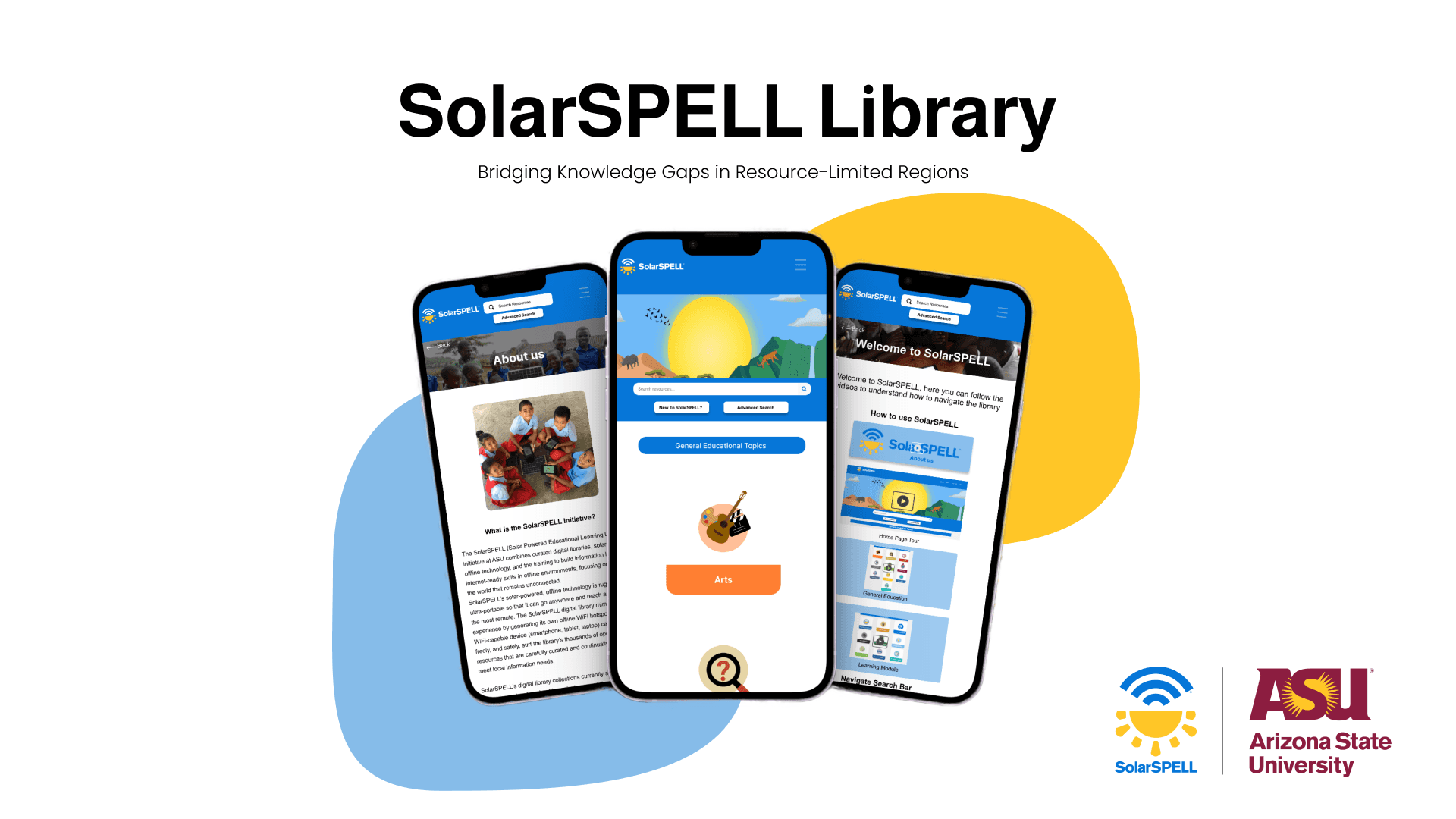
SolarSPELL (Solar Powered Educational Learning Library) is an initiative at Arizona State University that combines curated digital libraries, solar-powered offline technology, and training to build information literacy and internet-ready skills in offline environments — focusing on the half of the world that remains unconnected. Our team was tasked with redesigning the SolarSPELL library website to improve usability, navigation, and accessibility for diverse users across resource-constrained regions.
Overview
Heuristic Evaluation
Given the 16-week duration of the project, we had to strategically scale and prioritize specific sections of the library that required special attention and the integration of new features.
We applied 10 heuristic evaluation principles by Nielsen Norman and issues found using the evaluation were graded against Jakob Nielsen's four-step rating scale ranging from no problem to catastrophic.
Key Findings:
Lack of clear instructions on using the library
Poor About Us page layout
Index Page being confusing and not intuitive
Error recovery issues
Inadequate feedback mechanisms
Recommendations
Understanding financial activity felt unnecessarily difficult
Based on our research findings, we identified four key issues to address:
Issue 1 — Index Page
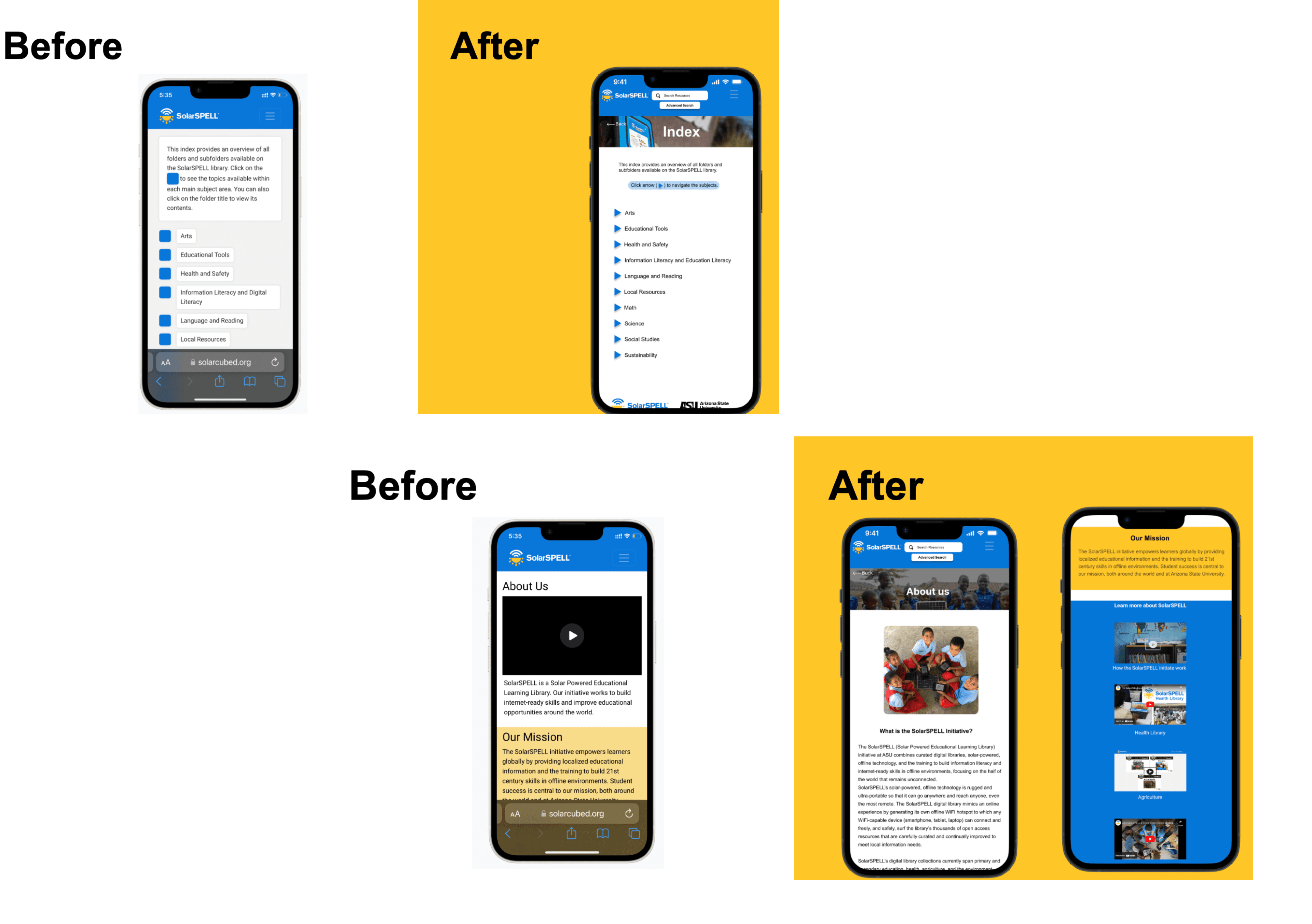
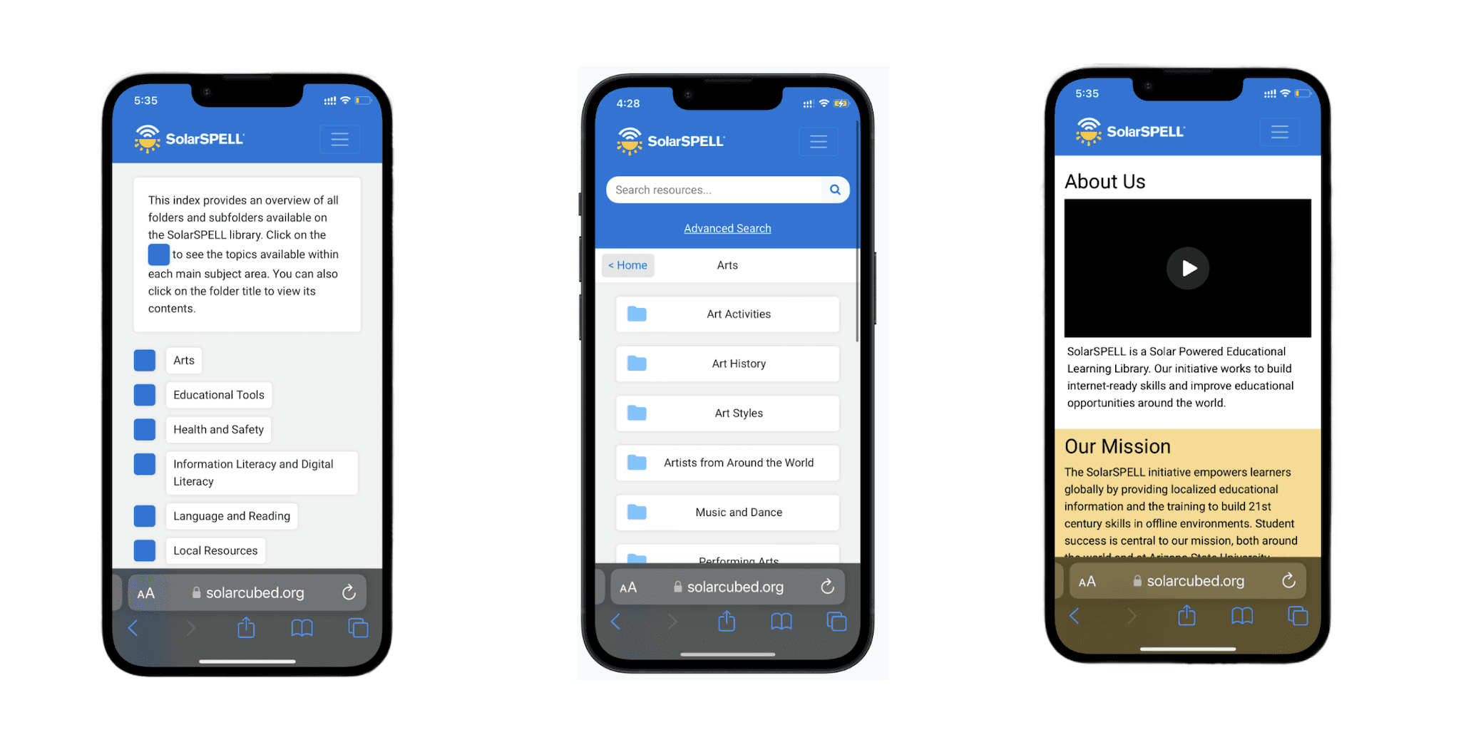
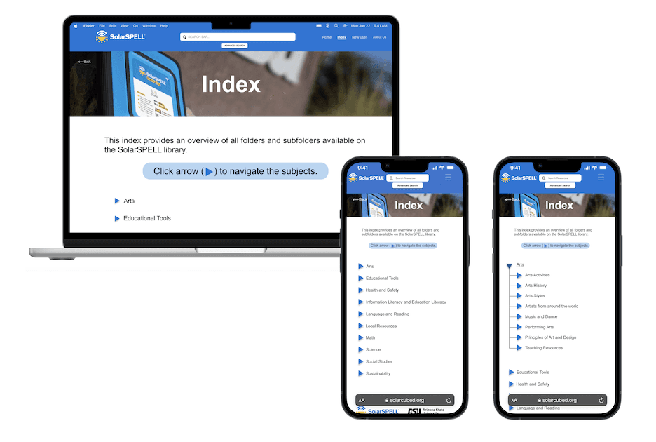
The Index Page had a long description, didn't indicate which module was open, had a different layout than other pages, and was confusing. This created user confusion and frustration. The original desktop and mobile views showed a flat list of topics with colored squares, no clear hierarchy, and no way to expand subfolders.
Issue 2 — About Us Page
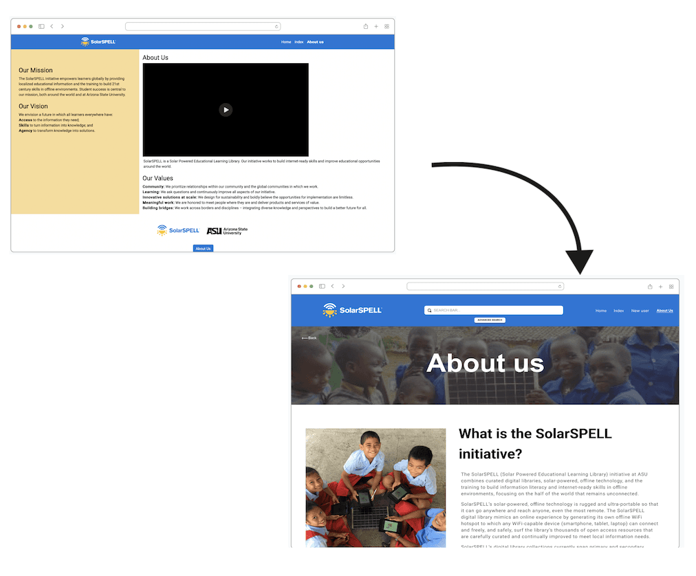
The About Us page lacked sufficient details about SolarSPELL. It failed to adequately inform users about the organization, its goals, and the impact of its work. The original layout was text-heavy with minimal visual hierarchy and no engaging imagery beyond a single embedded video.
Issue 3 — Inconsistent Layout
The overall experience across pages was inconsistent, creating a disjointed experience for all users accessing the library. Each page (Index, Module, About Us) followed different layout conventions, reducing learnability.
Issue 4 — New User Page
There was no dedicated onboarding experience to make it easier for first-time users to navigate the library.
Design Process
High-Fidelity Screens:
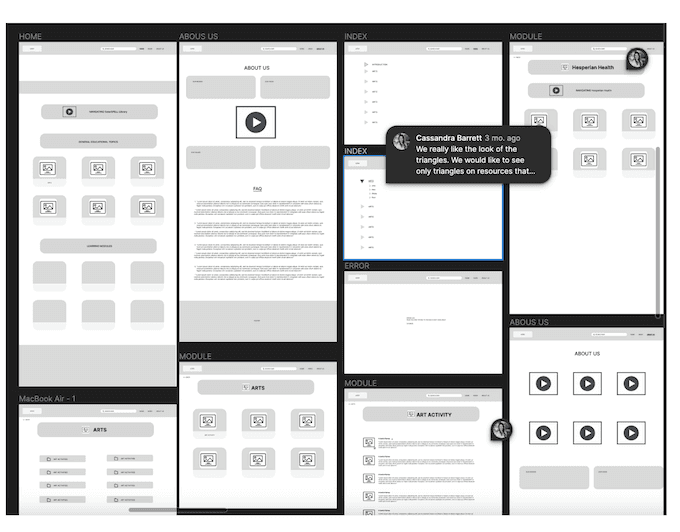
Moving from sketches to more detailed wireframes, I utilized Figma to create medium-fidelity screens for both desktop and mobile versions. These wireframes included all important features and layout elements, providing a clearer, more structured view of the design. Key screens wireframed included: Home, About Us, Index, Module, and the hamburger navigation menu for mobile.
High fidelity screens:
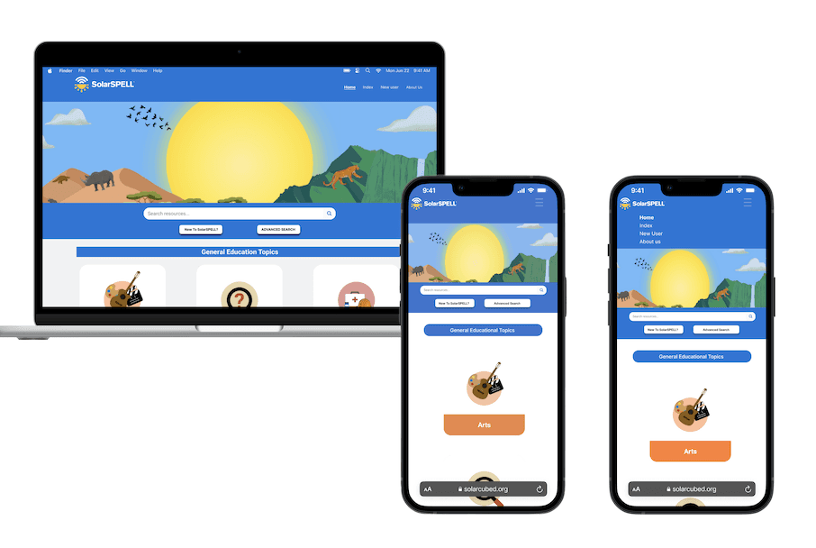
Home Page
The "New User" button is strategically placed to ensure easy accessibility for first-time visitors, providing a smooth onboarding process. Additionally, this feature is integrated into the dropdown menu for consistent and intuitive navigation on mobile screens.
Index Page
Implemented a revamped design featuring clearly organized folders and subfolders. Each folder is now accompanied by an intuitive arrow button, enabling users to easily expand and collapse subfolders with a single click. At the top of the page, a concise description provides an overview of the index, guiding users on how to effectively utilize the folder structure.
The redesign addresses previous usability challenges and ensures a more seamless interaction with the educational resources on SolarSPELL.
About Us Page
Redesigned with a prominent hero banner, richer content sections ("What is the SolarSPELL Initiative?"), and engaging photography to better communicate the organization's mission and impact.
Usability Testing
We tested the functionality of the application by observing real users as they attempted to complete tasks on it. Testing was conducted both in person and on Zoom.
Study Parameters:
8 Users
4 Moderators
3 Scenarios
6 Tasks
Test Scenarios:
Scenario 1 — New User: You are a new user trying to understand SolarSPELL Library.
Task 1: Find the new user page
Task 2: Look for more training modules
Task 3: Go back to the home page
Scenario 2 — Frequent User: You are a frequent user trying to navigate the library.
Task 1: Go to the Index page
Task 2: Look for the Arts submodule
Scenario 3 — Returning Visitor: You have seen the SolarSPELL website but are not a frequent user.
Task 1: Go to About Us
Task 2: Find the Peace Corps video
What Worked Well:
Users liked the new Index Page
Users found the New User Page helpful
The About Us page was easier to navigate
Areas for Improvement:
Could improve button options
Have New User option in navigation
Reduce text and make layout changes
Learnings
Working at SolarSPELL was an incredibly enriching experience that provided valuable insights and growth opportunities in my journey as a UX designer. One of the key learnings was the importance of designing for accessibility and usability in diverse and resource-constrained environments.
Ensuring that our educational modules were intuitive for users with little to no prior experience with digital interfaces underscored the need for simplicity and clarity in design.
Collaborating with cross-functional teams taught me the value of effective communication and teamwork. Coordinating with teams focused on communication, ML/AI, and content creation required adaptability and a holistic understanding of the project's ecosystem. This experience honed my ability to balance different perspectives and integrate feedback constructively.
Overall, my time at SolarSPELL reinforced my belief in the transformative power of thoughtful design and solidified my commitment to creating user experiences that are not only functional but also inclusive and impactful.